Hi guest! As you can see, the new Wizard Forums has been revived, and we are glad to have you visiting our site! However, it would be really helpful, both to you and us, if you registered on our website! Registering allows you to see all posts, and make posts yourself, which would be great if you could share your knowledge and opinions with us! You could also make posts to ask questions!
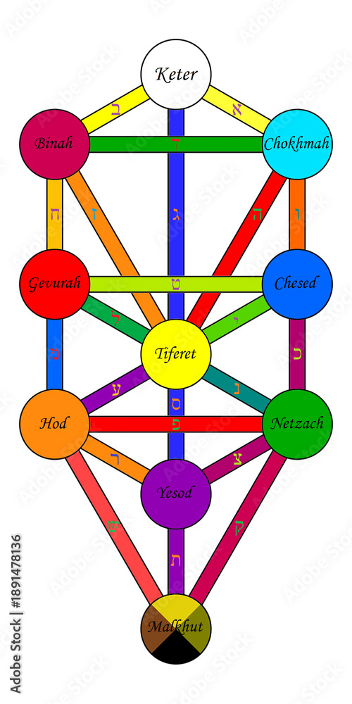
I am currently working Anita Krafts "Qabalah workbook for magicians" and I have not even finished making my tree of life. It states in the book to create a visual and tactile representation of the tree. So, I am simply painting it. However, i know the colors that correspond to the specific sephirah, but i am unsure what colors to use for the lines linking them together. Can someone help?
gives the correspondences of the colors in the four worlds. When speaking about the colors of the tree generally, the queen scale is typically used. Though the correspondences table at the bottom of the page gives all four scales, the visual representation on the site for some reason uses the queen scale for the sephiroth and the king scale for the paths. I don't think there is any particular reason for this. If I were you I would use the queen scale for your whole painting.
I am currently working Anita Krafts "Qabalah workbook for magicians" and I have not even finished making my tree of life. It states in the book to create a visual and tactile representation of the tree. So, I am simply painting it. However, i know the colors that correspond to the specific sephirah, but i am unsure what colors to use for the lines linking them together. Can someone help?
Painting the Tree of Life is a great way to create a tactile representation of it. For the lines connecting the Sephiroth, I personally recommend those two images I found online:
From Wikipedia (ignore the fact that the Sephiroth have the blue color by default here, focus on the lines)
(This one is much more representative of Kabbalah and the lines connecting the Sephiroth)
Painting the Tree of Life is a great way to create a tactile representation of it. For the lines connecting the Sephiroth, I personally recommend those two images I found online:
From Wikipedia (ignore the fact that the Sephiroth have the blue color by default here, focus on the lines)
(This one is much more representative of Kabbalah and the lines connecting the Sephiroth)
Of course, a bit of 'artistic license ' might be needed in the actual colors you end up mixing . In my 'magical artworks' I always felt an overall tone and balance is better to achieve than a jarring inharmonious look / feel . In any case , looking at correspondences , color names can vary and go in and out of fashion (eg 'Bengal Red' ain't what it used to be ) and consider if you are copying of a screen image its going to be different from a paint you mix and apply to paper . I would advise to not get too caught up in that and go for a close harmony over all .
Another way of interpreting the colors in the four worlds is via Don Pavy's color theory ( he wasn't into magic but I think he intuitively stumbled upon something ) with 4 'types' that pretty much seem to equate to the 4 worlds
I will use the Thoth courts to explain ( meaning; I have put the courts at the front of the 'types' that Don describes 'colors with voices' )
Knights ; Colors that scream - they demand you attention ; Bright, shocking, forceful, or modern fluorescent/neon colors that scream at the viewer and immediately demand absolute visual attention.
This range sits at the top of visual dominance. It consists of highly modern, synthetic, or fluorescent/neon pigments that do not appear in traditional classical palettes. These colors bypass subtle aesthetic appreciation and forcefully demand immediate optical attention. In visual design, they act as pure exclamation points because their high-energy wavelengths overpower surrounding hues.
( A fluro Tree of Life ?! Yikes ! )
Queens ; Colors that command . Pure, primal, and foundational colors that possess a natural authority and high chromatic presence without being overtly jarring.
This range comprises clean, fully saturated primary and secondary hues in their pure state. These are the historic anchors of the color wheel that possess natural, uninhibited visual authority without needing to be chemically altered into neon or fluorescent states. They form the backbone of bold compositions and command the structure of a palette through clear, high-chroma presence
Princes; Colors that speak . A massive, diverse category of mixed colors that "speak to us" more subtly and form the main body of our visual environment.
This is by far the largest, most expansive range in a working artist's environment. It contains all intermediate, modified, or desaturated mixtures where pure colors are broken down by one another. These mixed colors "speak" to the viewer on a deeply nuanced level. Because they represent the majority of hues found in natural landscapes, textures, and everyday environments, they carry the narrative weight of a design
Princesses; Colors that whisper . The soft pastels , those with subtle tones and saturation .
This fourth tier occupies the quietest end of his scaling system. It consists of highly delicate, diluted, and low-energy color formations—such as soft pastels, high-key tints, and heavily washed hues. Rather than commanding space or fighting for attention, these colors easily recede into backgrounds, adapt quickly when influenced by neighboring tones, and function to stabilize or give breathing room to more dominant hues
Its rather fascinating ; I did a study on the historical development of colors ; starting at the 'neolithic palette ' ( charcoal, clays , ochers ) and as time went on we discovered how to produce other colors and added them to our palette ; like green and brilliant blues the Egyptians used , 'Ultramarine ' from crushed lapis lazuli stone - imported all the way from Afghanistan , the Phoenicians 'Tyrian ' purple , at first rare and expensive hence the robes of Emperors. The Victorian 'Mummy brown ' ( you can guess how they made that ! ) The first modern synthetic 'Prussian blue' , etc.
In order for you to know what path (the connecting line) is which, you would also have to know the order of paths.. Use this diagram to help and then I listed the colors below. The elements, zodiac and hebrew letter associations are also listed incase you wanted to add some more symbolism into your artwork